The effect of color on paint painting and the principle of interior color and shadow adjustment
1. What is color adjustment, and what effect will it get when it is applied in paint coating?
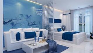 Because color has its own characteristics, it has a strong impact on people's vision, psychology, and physiology. When people see a certain color, they immediately feel pleasant (good-looking) or unpleasant (not good-looking), and also feel light and dark, light and heavy, cold and warm, hard, soft, strong and weak. In the interior paint coating, this characteristic of color is applied skillfully and flexibly to create a pleasant and comfortable working or living environment, which is called color adjustment.
Color adjustments for indoor applications will have the following effects:
(1) The environment becomes brighter;
(2) Relieve eye and body fatigue;
(3) Enhance the fun of work and improve work efficiency;
(4) Create a specific environment that embodies a certain style and mood;
(5) Reduce accidents and disasters;
(6) Improve the quality of work;
(7) Strengthen the psychology of caring for material things.
2. What principles should be followed when adjusting indoor color and shadow to reduce eye fatigue?
The quality of indoor color adjustment is very important to avoid unnecessary fatigue on the eyes.
Generally, the following principles need to be followed:
(1) There should be no glare indoors;
(2) The lightness contrast should be small, and the same lightness should be used;
(3) Reduce the vividness of indoor colors;
(4) Color matching should be selected so as not to produce afterimages of complementary colors (that is, the phenomenon of complementary colors of primary colors looming in front of the eyes);
(5) The reflectivity of the ceiling and walls should be high;
(6) The lightness of machines, equipment, furniture, etc. should be moderate, that is, the reflectivity should be 25%-6o%;
(7) It is better to make the central part of the work brighter than the surrounding manuscripts;
(8) In order to distinguish objects easily, it is appropriate to use lightness and vividness contrast;
(9) The tone of the indoor lighting light should be close to the natural light.
- 1Car body paints gloss detection
- 2Some basics about paint
- 3What is the difference between paint and paint?
- 4Color and brightness factors for signal testing
- 5Paint rheology and its function
- 6What is the volume solids in paint?
- 7Thixotropy - the viscosity of inks and paints
- 8Conventional color determination method
- 9Properties of organic coatings