What does color have to do with safety?
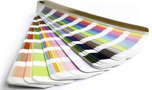 As a substance, color exists in the sub-world universally, and it is one of the objective basis of human psychological activities. The purpose of using color in architecture is to use people's psychological reflection of color to achieve the expected effect that is beneficial to life and work. Color has become a common language in the world. For example, dangerous places are the most eye-catching, and generally painted with a color that can be confirmed from a distance. Therefore, color and safety have a close aesthetic relationship.
red
It is a strong stimulating color, also called exciting color. Because of its characteristics, it has been widely used in industry, and it is mostly used as a sign of safety.
yellow
It's daylight. Its eye-catching effect is widely used in industry.
blue
It is a cool color. Has a calming, cooling character. It is mixed with white and has a wide range of architectural applications. Used in industry as a sign on plumbing equipment.
orange
It is an exciting color, and its visual effect is between red and yellow. Because the color with high lightness has good visual effect, it is often used as a warning color for emergencies.
green
is the background color. It has no stimulating effect on people's psychology, and it is not easy to cause visual fatigue. It gives people a sense of security, so it is often used as a safety color in industry.
other colors
Black, white and gray are widely used in architecture; especially white, which has the effect of reducing color, and sometimes in order to reduce the chroma of strong colors, an appropriate amount of white is added to solve the problem. The reflection performance of self-color is very good.